CBRE Calibre Creative Group
Salt Lake City Global Logistics Center
We built a brand as ambitious as one of the largest industrial developments in the U.S. and proved that strategic branding can be a competitive edge for industrial real estate.
How do you build a brand into a strategic edge?
Salt Lake City Global Logistics Center (SLC GLC) is one of the largest industrial developments in the United States. It spans roughly 3,000 acres entitled for up to 40 million square feet of build-to-suit space and owner/user land for sale, delivered across several phases.
But scale alone couldn't tell its story.
Despite years of leasing progress, the market didn't grasp what SLC GLC offered. Prospects saw that it was big but missed the depth of quality and detail that truly set the development apart. Location, intermodal logistic support, build quality, and a bespoke design process for each tenant were all among SLC GLC’s most attractive features, and all were unknown to tenants.
The brand was outdated, and did not reflect the scale of the development opportunity. Our task was to bring SLC GLC into the spotlight and make its true ambition palpable.
Strategic Depth
CBRE Calibre Creative Group was engaged to communicate the development's full potential with a comprehensive identity system capable of projecting continental-scale ambition into the market.
Industrial branding often stops at a shade of blue and a site plan. SLC GLC gave us the chance to build a deep brand in a shallow competitive pool, a uniquely distinguishing characteristic in the battle for attention.
Our analysis set three requirements. The brand had to scale across multiple phases of development while ensuring each phase felt distinct. It had to balance local recognition with a future-forward aesthetic. Finally, it had to communicate infrastructure capability and tenant value at the same time. We mapped SLC GLC against a set of national and international peers and triangulated a future-proof position that stood apart from all of them.
Our solution was an adaptable brand that captures both the development's scale and the personalized experience tenants receive when partnering with the team.
Building Our Edge
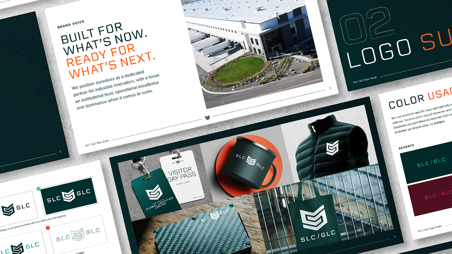
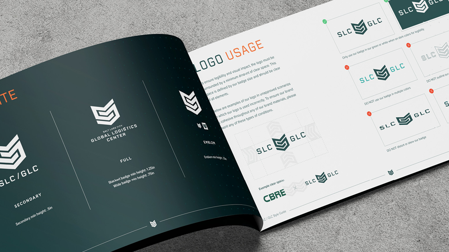
We designed every element of the brand to make an impression. The faceted, chevron-built mark evolved from the previous logo to retain recognition while signaling a new level of quality and precision engineering.
Many Phases, One System
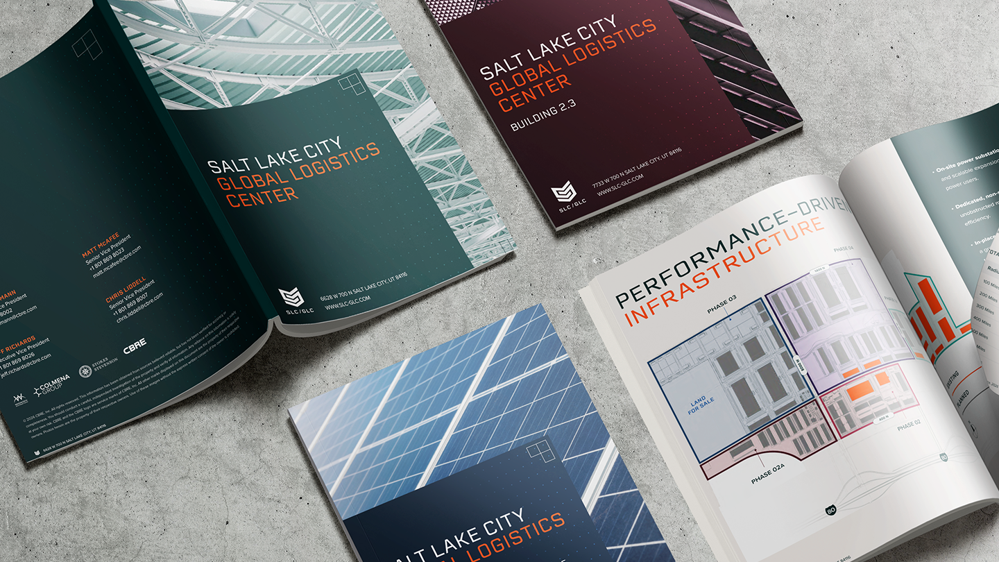
A bold palette pairs a deep green and a muted orange, while gradients draws the reader’s eye across the content naturally. Phase-specific accent colors let each stage of development read as its own chapter within the larger system.
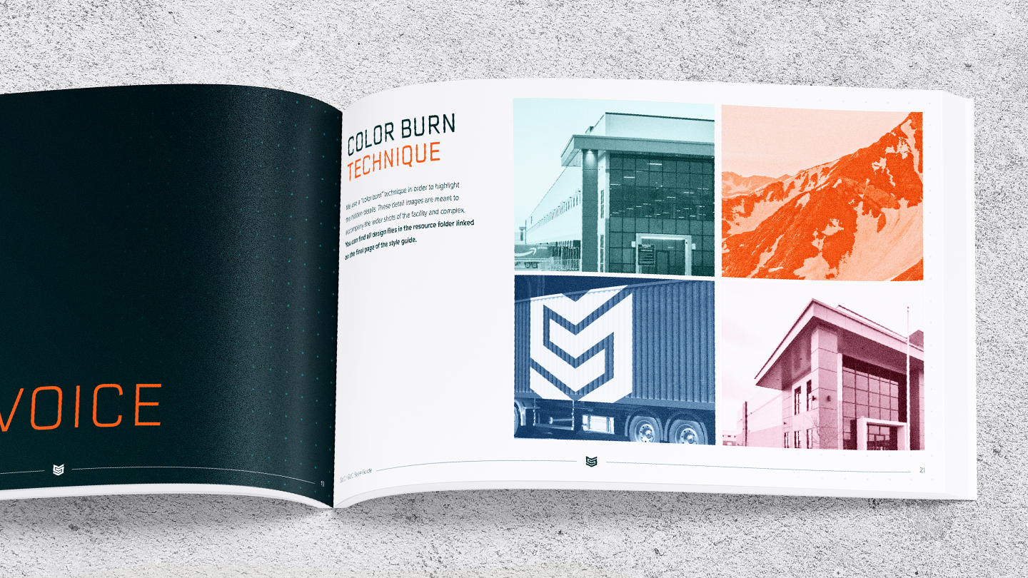
Color Burn
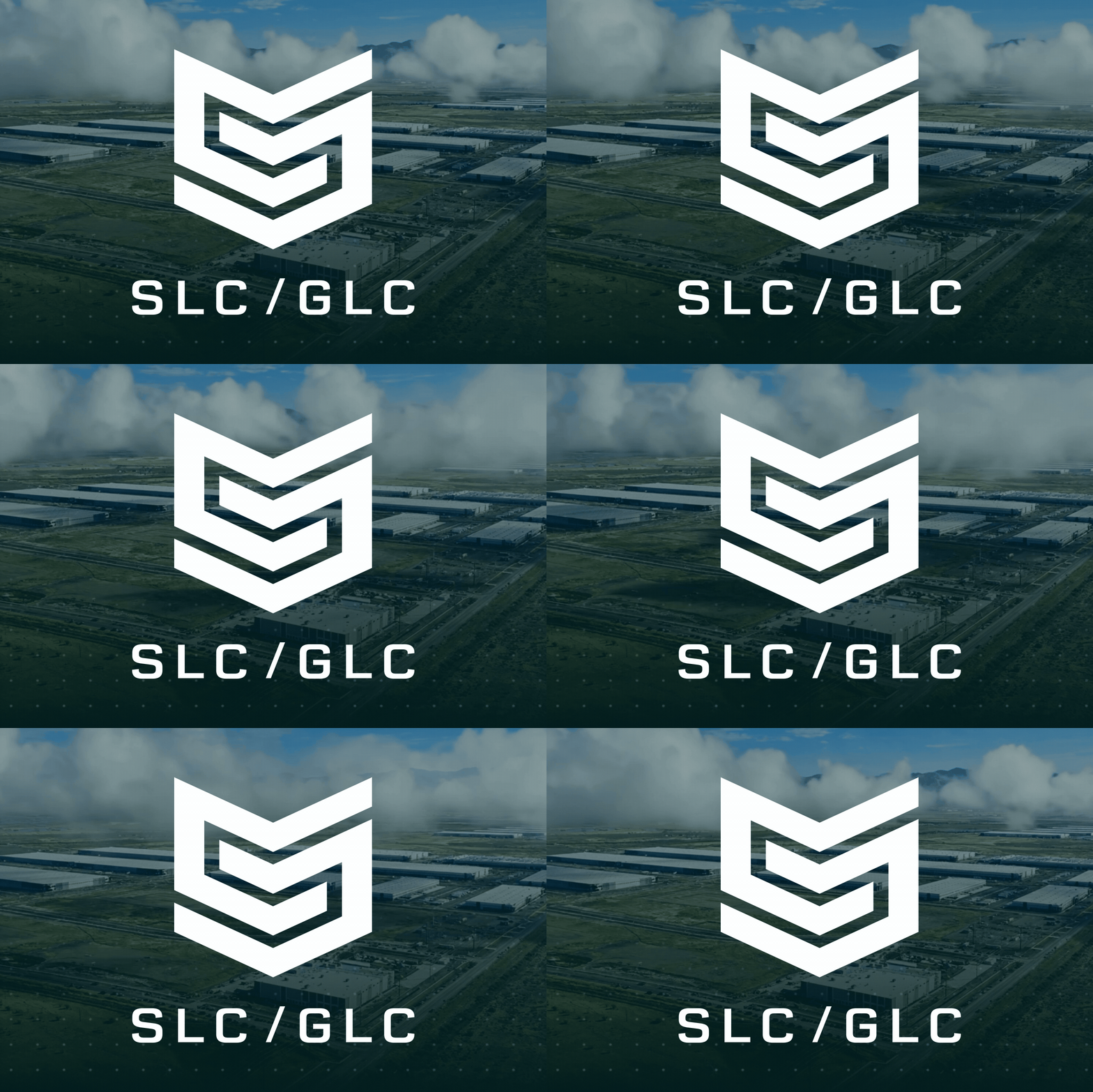
A signature color burn treatment draws out the hidden details of the buildings, from steel trusses to facade lines, and counterbalances wide-scale photography in more muted tones.
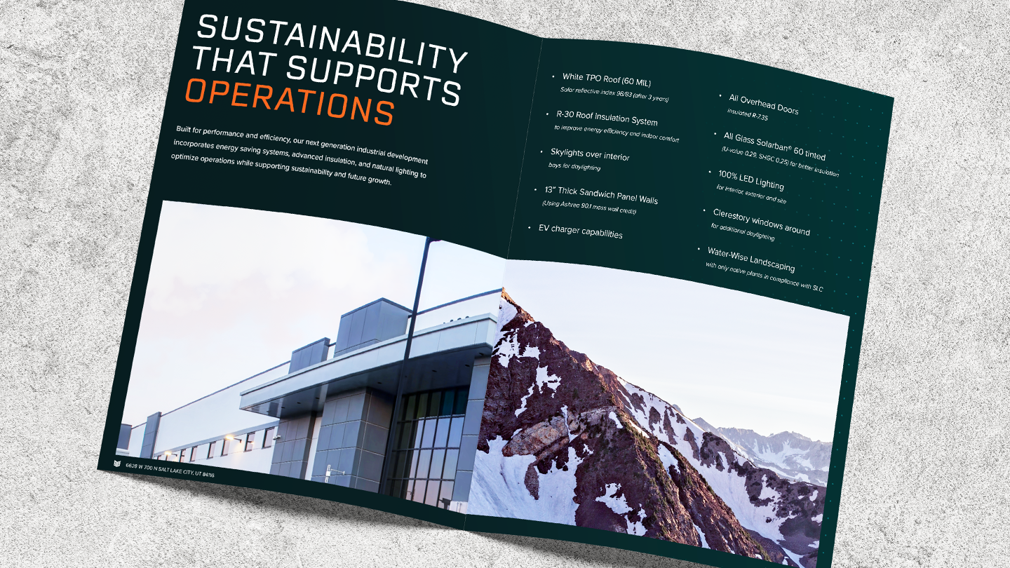
Rooted in Utah
A collage technique merges the development's architecture with Utah's mountains and skyline, following the lines and movement of both. The effect conveys enormous scale grounded in a specific sense of place.
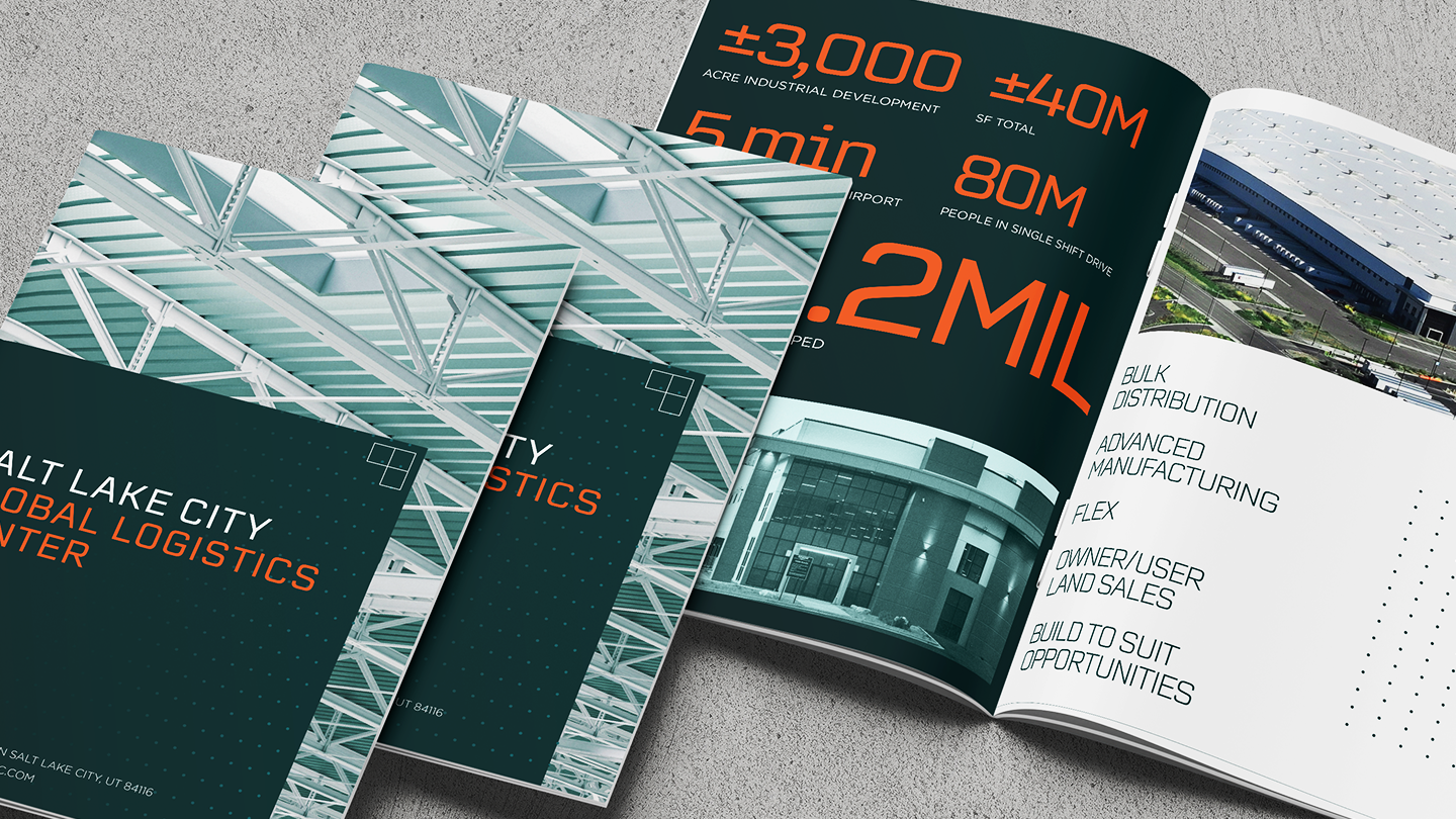
Voice and Type
The brand voice balances confidence with a more casual delivery of the project’s offerings. Typography pairs the geometric, technical Erbaum for headlines with Gotham for body copy, reinforcing a tone that is benefit-driven rather than spec-heavy.
The Results
Through strategic positioning, bold branding and occupier-focused storytelling, we created a brand as ambitious as the development itself. SLC GLC now has a modular, scalable identity built to grow phase by phase with the campus without losing coherence. The work earned a 2026 MUSE Gold Award in Corporate Identity and proved that brand can be a competitive edge in industrial property marketing. That edge will only compound as each new phase and activation reaches the market.
CBRE Calibre Creative Group has transformed the way we approach marketing for the Global Logistics Center in Salt Lake City, Utah. From developing refreshed, more effective marketing materials and strengthening the property's brand identity to shaping strategies that better connect with key decision-makers, Calibre has had, and will continue to have, a significant positive impact on the success of one of the largest industrial developments in the country.

Let’s reimagine property marketing together.
CBRE Calibre Creative Group’s in-house team of industry leaders delivers award-winning, full-spectrum strategies that open new horizons in commercial real estate marketing.